Monster Government Solutions
UX Director
August 2020 - September 2025
Government Workforce Management
My primary focus was designing business-to-government (B2G) workforce management tools such as hiring platforms for federal agencies, cloud workforce case management system, and labor exchange platform for state and local governments. Features included job posting management, case management, job seeker portals, employer portals, candidate matching, application tracking and program participation tracking.
I led a team of six designers in supporting existing platforms, building new sites from the ground up, creating a cohesive brand across the products, developing design strategies to modernize decade-old live sites used daily by power users, and help product owners ideate new business opportunities.

Measures of Success
B2G Audience Definition
For B2G products, I split the audience into two high-level groups, power users and potential buyers. I set separate measures of success for each.
Power users
For power users, I had to gauge success by strictly qualitive means, customer satisfaction. This typically meant the best I could hope for was the lack of complaints. Our only contact with the client is through account managers and we didn’t expect them to relay any positive feedback to us even if they received any. Internally, the UX and product teams gauged our successes on how well we met the requirements and through engaging, intuitive, and streamlined designs.
Potential buyers
For potential buyers, I was able to measure success quantitively through UX scores given by potential buyers and how they compared to competitors. Sometimes the scores came with feedback notes highlighting what the buyer liked and didn’t like about our UX and our competitors as well. This gave us clear actionable items we could act on and see how we fared in future requests for proposals.

I defined success metrics and tailored design strategies for each target audience.
CASE STUDY
Design evolution strategy
When I joined, one product was nearly a decade old with an antiquated look and feel. Although I would have loved to design a complete UI overhaul, it simply wasn’t cost effective.
Cost conscious plan
To keep the product feeling relevant, I created an evolutionary design strategy. I collaborated with the front-end developers and QA, and together we came up with cost-conscious plan which involved identifying low-risk, maximum-value changes which could be rolled out over time using future-proof reusable components.
Prioritization
We built new features using the new components and stack ranked high-traffic work user flows to retrofit. We created prioritized, well-defined, t-shirt-sized backlog items and grouped some to be built together as to avoid a disjointed look and feel while updates were being made. Front-end engineers could pick the items up when they had available capacity.
The potential-buyer audience
When setting priorities, we also took the potential buyer group into consideration. As an example, there are certain features that are relevant to only 5% of job seekers. However, many potential buyers were interested in having this complex featured demoed because the feature was one of the government’s requirements. The percentage usage by power users was low but was high for potential buyers. In those cases, those flows would go up in priority.
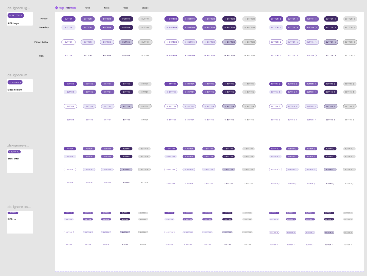
New components for different button styles were used in new features and rolled out to older ones in a targeted manner.
Product evolution strategy
When evaluating the viability of potential new products for proposal, I collaborated with product owners using a product lifecycle approach.
Together, we mapped feature sets and flows across releases, providing a sense of the value of the MVP as well as subsequent phases. I created a high-fidelity, happy-path prototype for phase one to give a clearer, more in-depth picture of what the actual product might look like, how it would function, and the value it could bring to each persona.
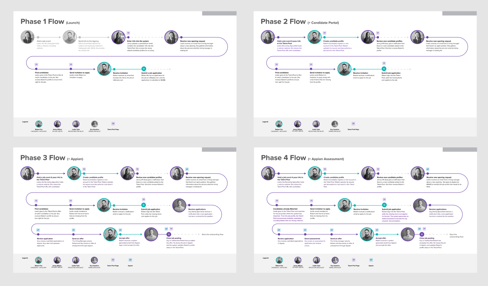
Using a phased approach, the product owners and I demonstrated the value proposition for the initial product and how it could be built upon in future releases.
Branding
The design needs for traditional websites and data-dense maximum-efficiency sites are very different. Design components that have the same functionality need a completely different look and feel.
To bring a sense of cohesion across the suite of products, I created an umbrella brand guideline where each product could have its own complementary guidelines that align with the umbrella system. The standardized look and feel strengthened the company’s portfolio and was especially important for products that could be sold as one integrated bundle.

Each product brand has its down color palettes and typefaces which are complementary and align with the umbrella system.